Designing for a delightful payment experience
Overview
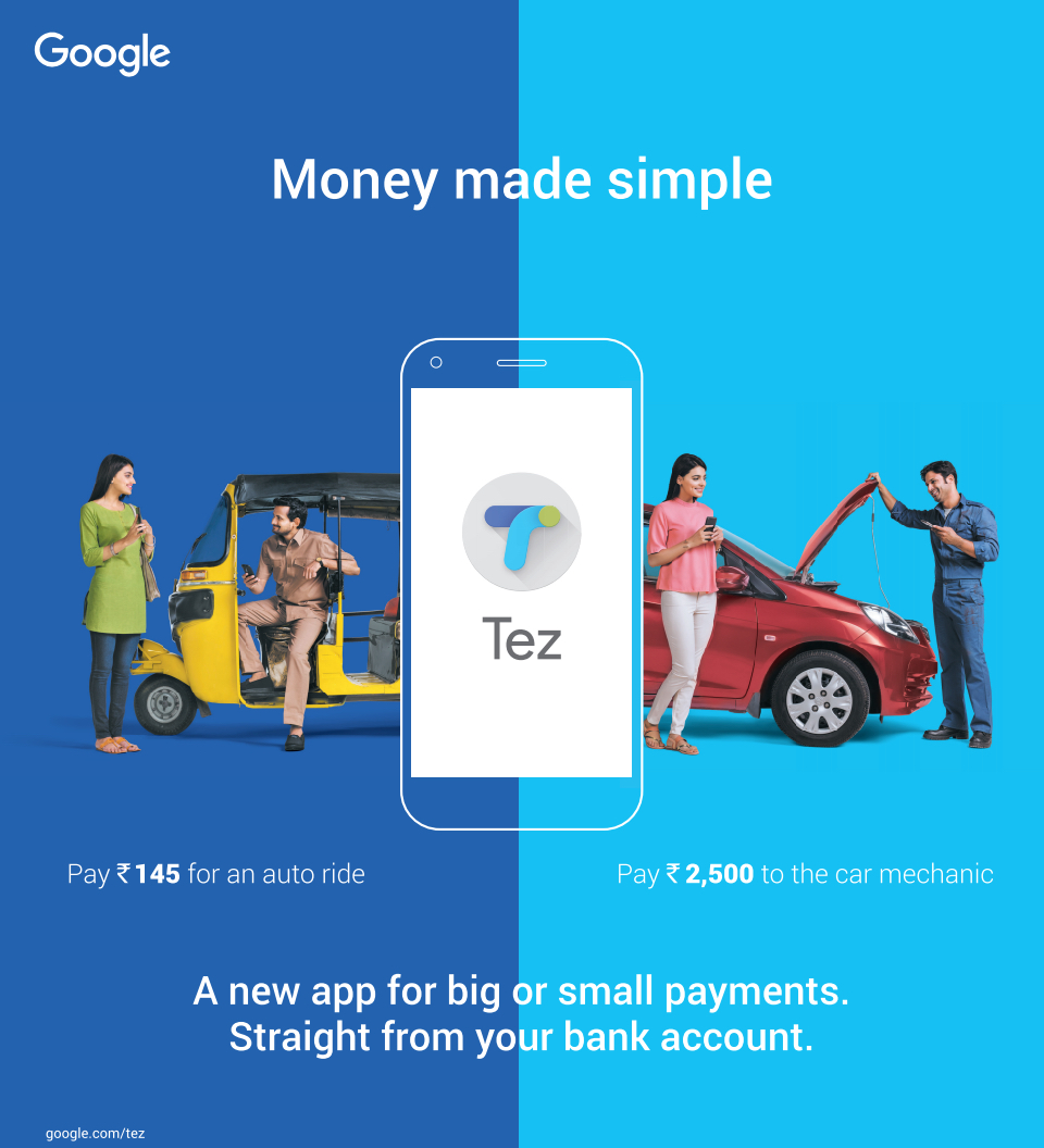
Google Pay was launched in September 2017 as Tez specifically for India helping consumers simplify peer to peer payments, paying bills and trasacting with merchants, most of them getting familiar with digital payments for the first time ever.
Link: pay.google.com
Timeline: Sep 2017 - Nov 2017
My Role: As a UX Intern, my contribution to the project was a UX framework that focuses on incorporating delight in the payment experience. Collaborated with stakeholders across geographies, discovered, defined and iterated through an entire spectrum of concepts which were released as the Sparks feature in the app.
Resolving the brief
At the start I spoke to team members from eng, PM & design to gather an overview and the larger perspective of why Google was launching Tez in India. After understanding and synthesising the inputs I moved on to narrow my scope of intervention to bringing delight into the current customer paying experience in Tez.
Source: Tez
Auditing the current design
This gave me an opportunity to provide feedback from a new user’s angle and also understand it better. Why certain decisions are taken and the constraints associated with the current implementation.
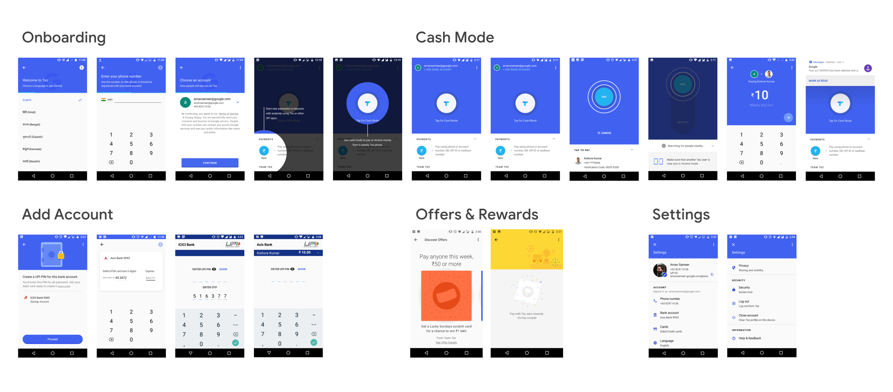
Critiquing the existing product
Through this analysis I tried to ask a couple of questions like:
- How is it Tez structured?
- Where was it confusing?
- Where was it elegant?
- What phases of use was I guided through?
- What is significant, different, innovative, or fun about it?
In attempting to answer these questions, I was trying to figure out the design decisions that elicited each of my reactions.
Time to dive deep
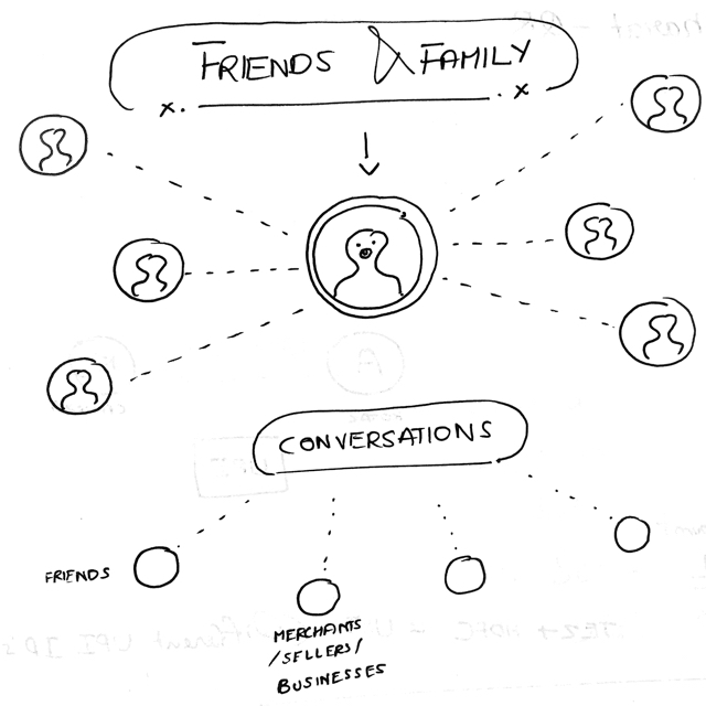
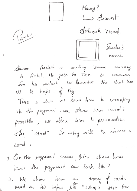
After the critique, I had a better idea of how to think about my area of intervention in the current architecture of the product. I started thinking about wrappers as a form of sending payments in "delightful packets". Packets that would make the payment experience more personal and emotionally expressive.
Conducting precedent studies
India was already a crowded market for payment apps. I narrowed my study to apps that were incorporating payments and a conversational UI to help manage them. Some motives of the study were to find out what strategies they were using to retain and engage their users.

These apps provide a payment service within a chat interface and also use the following features for retention and increasing engagement with their users:
Stickers
Media share (Photo / Video / Sound)
Reactions to messages
Coupons
Gifts
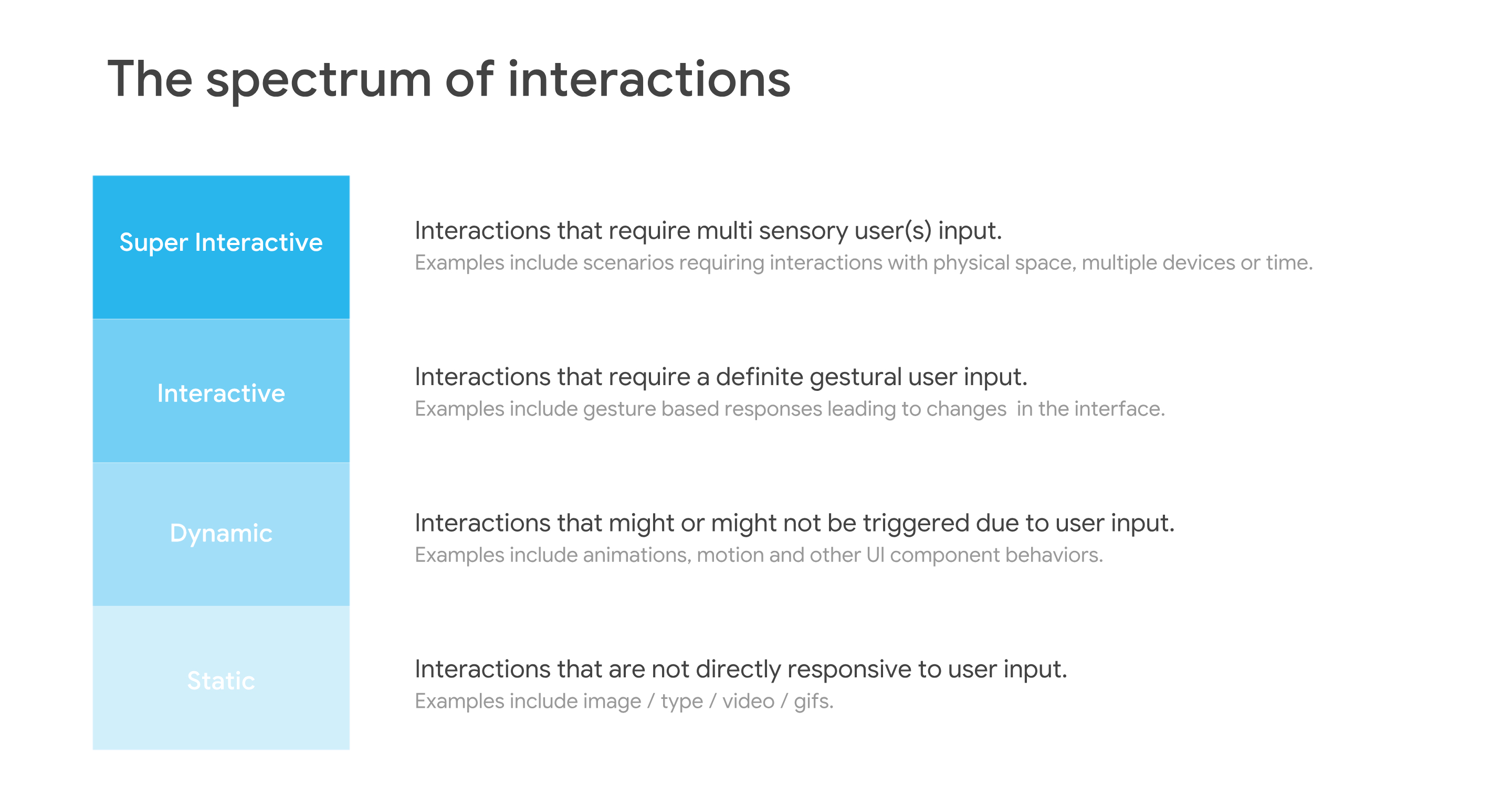
Generating a spectrum of concepts
I continued my ideation process and put them across what I called The spectrum of interactions. This included concepts that required no to multiple interactions from the user
Prototyping the final framework
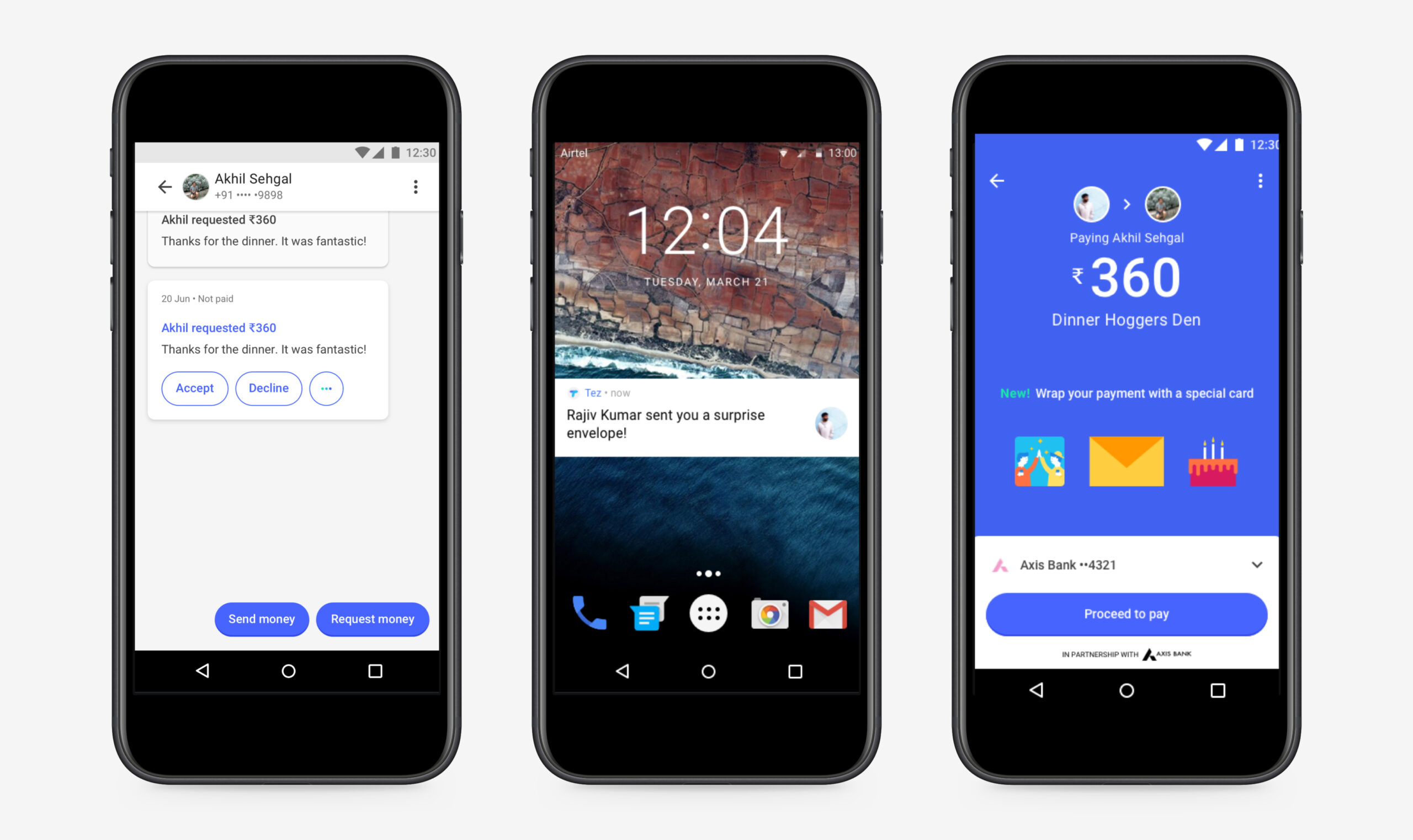
I took forward three ideas for interactive wrappers that users could send as their payments. A thank you card, an interactive envelope and a birthday cake that had candles the user would have to literally blow out ;) after receiving it!
Sender flow for an interactive envelope.
Receiver flow for an interactive envelope.
Sender flow for an interactive birthday cake.
Receiver flow for an interactive birthday cake.
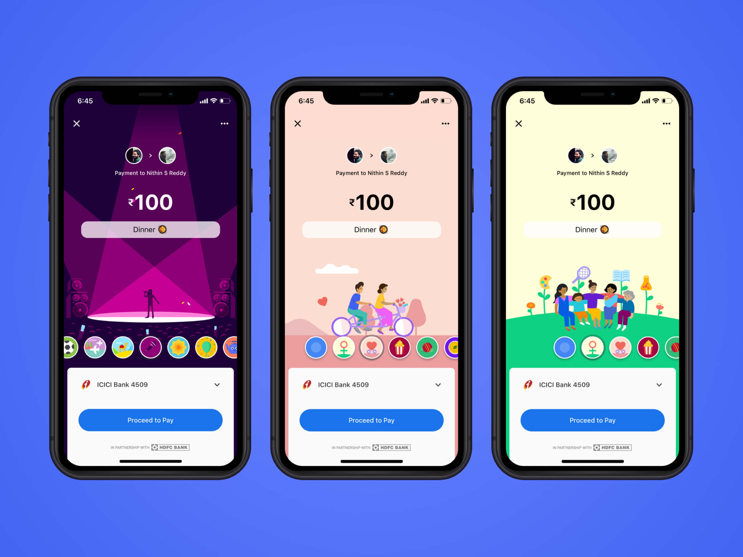
The final designs implemented by Google
Explore more projects

SquadStack PartnersProduct Design
QatalogProduct Design

Outlook on the Mobile WebProduct Design
Lernr - meet. learn. evolveProduct Design

BillDesk One ViewProduct Design
KhelNow - Play is the way!Product Design

CALM.ioProduct Design
MuzeMeProduct Design

The Power of WeInformation Design

Data Privacy: The Great Bi-Partisan DebateInformation Design
